

Viac o knihe
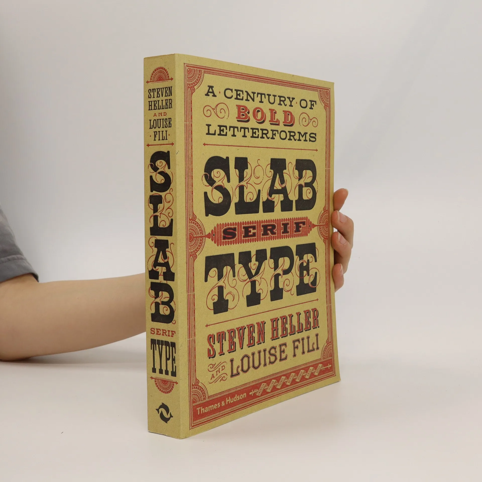
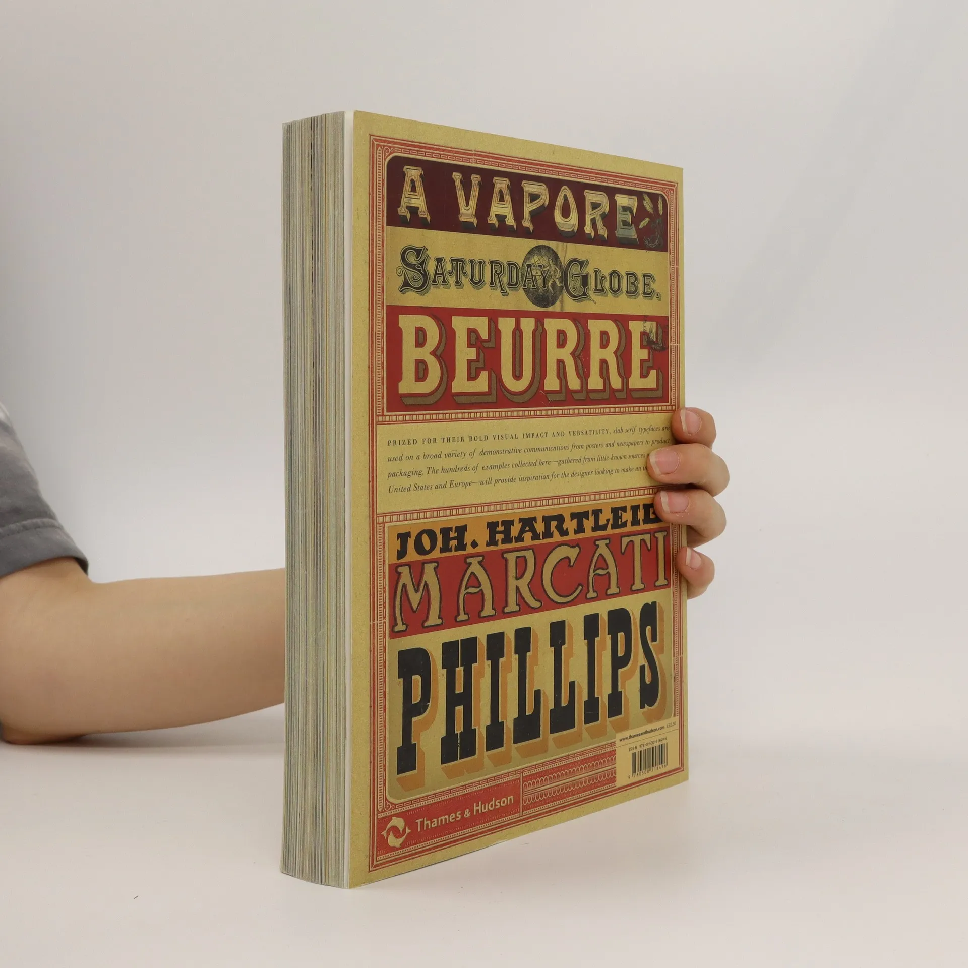
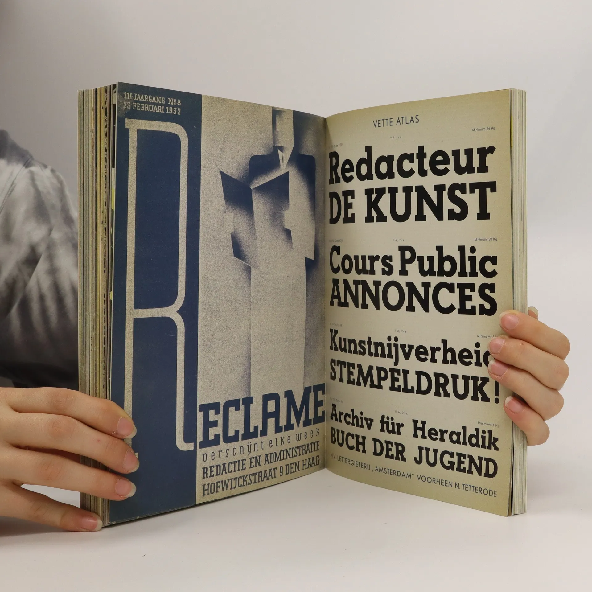
A compact, yet comprehensive design resource, expertly selected by graphic design’s leading historians The slab serif typeface—in their classic form, wood types made for large-scale posters, ads, and newspapers—may not be as all-purpose as the gothic or sans serif, but it is equal, if not more powerful, in graphic appeal. Since being introduced in the nineteenth century, slabs have become ubiquitous and are today as popular as ever. Slabs come from a genre of Egyptian typefaces (some of the leading slabs are called Cairo and Sphinx) brought back to France by Napoleon and marketed in specimen sheets and books as representing a glorious heritage brought to the present. In 1931, Morris Fuller Benton created the Stymie typeface, a reworking of a slab serif type popular in Europe at that time: Memphis. The IBM logo is one of the most famous slab serif marks. The serifs were often exaggerated so they would not result in simply beautiful letterforms but would be functionally superior to other faces. Slabs, therefore, came in many iterations and were eventually recognized as a face with many characters—and nationalities. Following the cult typography volumes Scripts, Shadow Type, and Stencil Type, this new volume comprises an artfully curated selection of hundreds of international and classic examples to inspire fresh and unexpected typographic ideas.
Nákup knihy
Slab serif type, Steven Heller
- Jazyk

- Rok vydania
- 2016
- Väzba
- (mäkká)
Tu nám chýba tvoja recenzia
- Titul
- Slab serif type
- Jazyk
- anglicky
- Autori
- Steven Heller
- Vydavateľ
- Thames & Hudson
- Rok vydania
- 2016
- Väzba
- mäkká
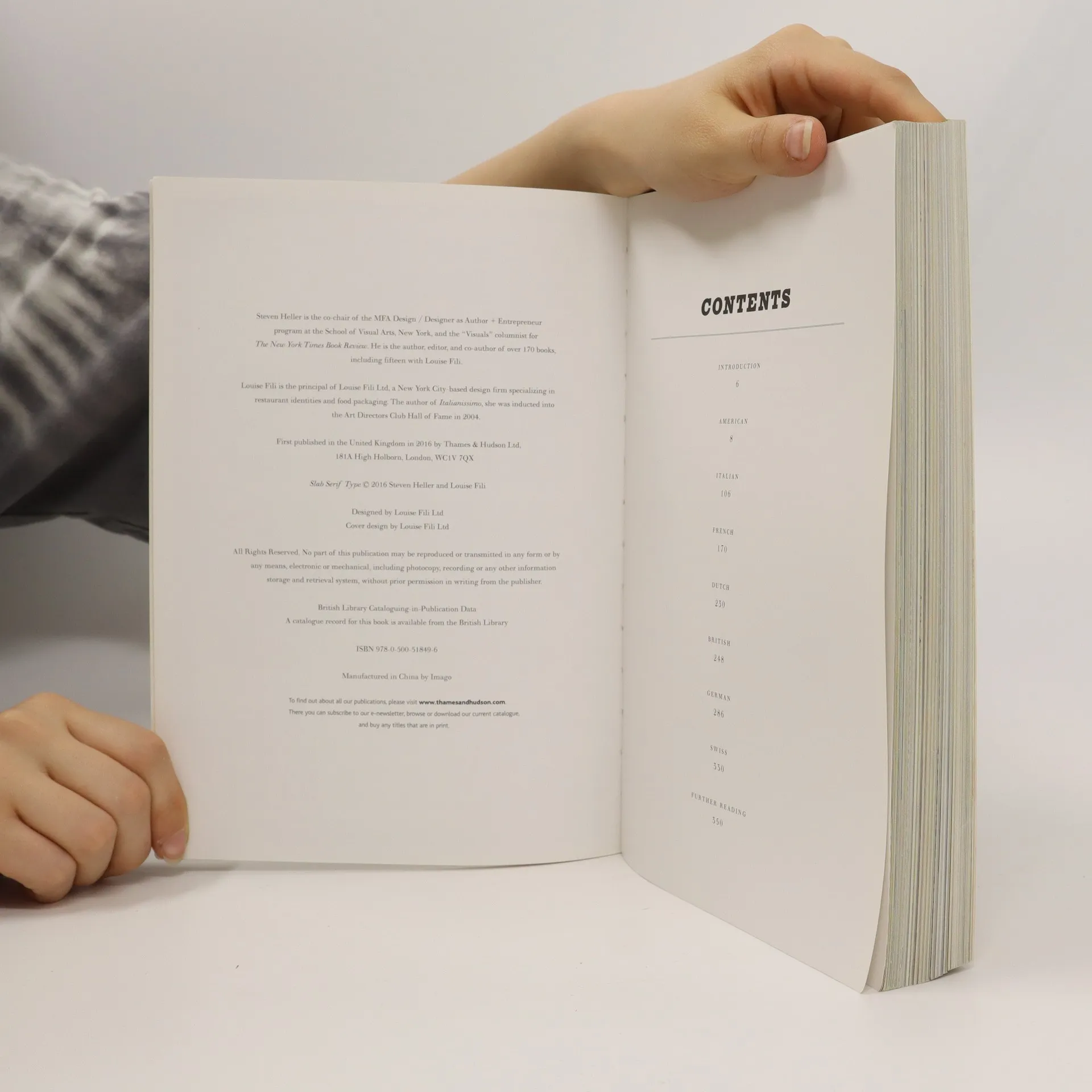
- Počet strán
- 352
- ISBN10
- 0500518491
- ISBN13
- 9780500518496
- Série
- Kategórie
- Štítky
- Ilustrácie
- Hodnotenie
- 4 z 5
- Anotácia
- A compact, yet comprehensive design resource, expertly selected by graphic design’s leading historians The slab serif typeface—in their classic form, wood types made for large-scale posters, ads, and newspapers—may not be as all-purpose as the gothic or sans serif, but it is equal, if not more powerful, in graphic appeal. Since being introduced in the nineteenth century, slabs have become ubiquitous and are today as popular as ever. Slabs come from a genre of Egyptian typefaces (some of the leading slabs are called Cairo and Sphinx) brought back to France by Napoleon and marketed in specimen sheets and books as representing a glorious heritage brought to the present. In 1931, Morris Fuller Benton created the Stymie typeface, a reworking of a slab serif type popular in Europe at that time: Memphis. The IBM logo is one of the most famous slab serif marks. The serifs were often exaggerated so they would not result in simply beautiful letterforms but would be functionally superior to other faces. Slabs, therefore, came in many iterations and were eventually recognized as a face with many characters—and nationalities. Following the cult typography volumes Scripts, Shadow Type, and Stencil Type, this new volume comprises an artfully curated selection of hundreds of international and classic examples to inspire fresh and unexpected typographic ideas.