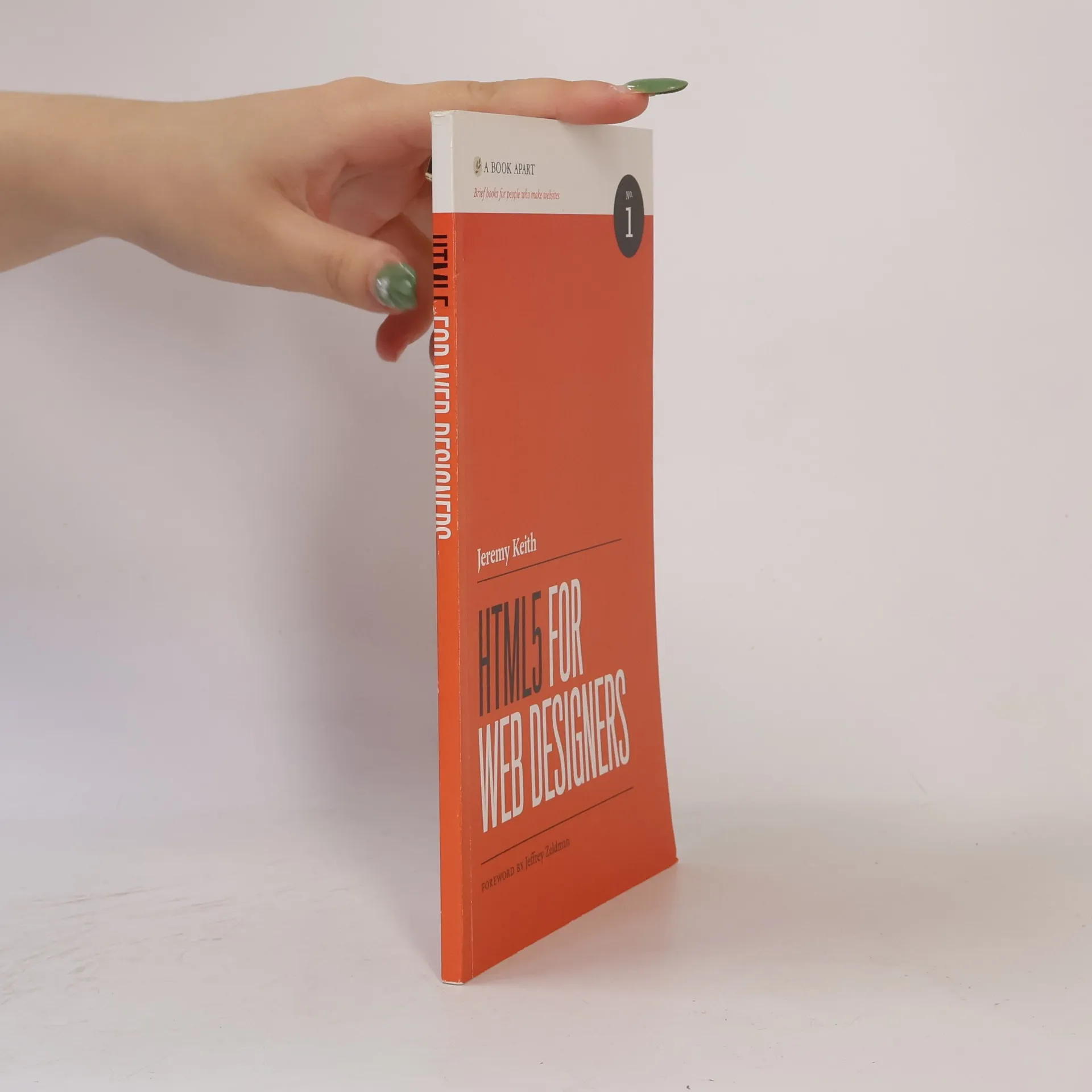
HTML5 is the longest HTML specification ever written. It is also the most powerful, and in some ways, the most confusing. What do accessible, content-focused standards-based web designers and front-end developers need to know? And how can we harness the power of HTML5 in today’s browsers?
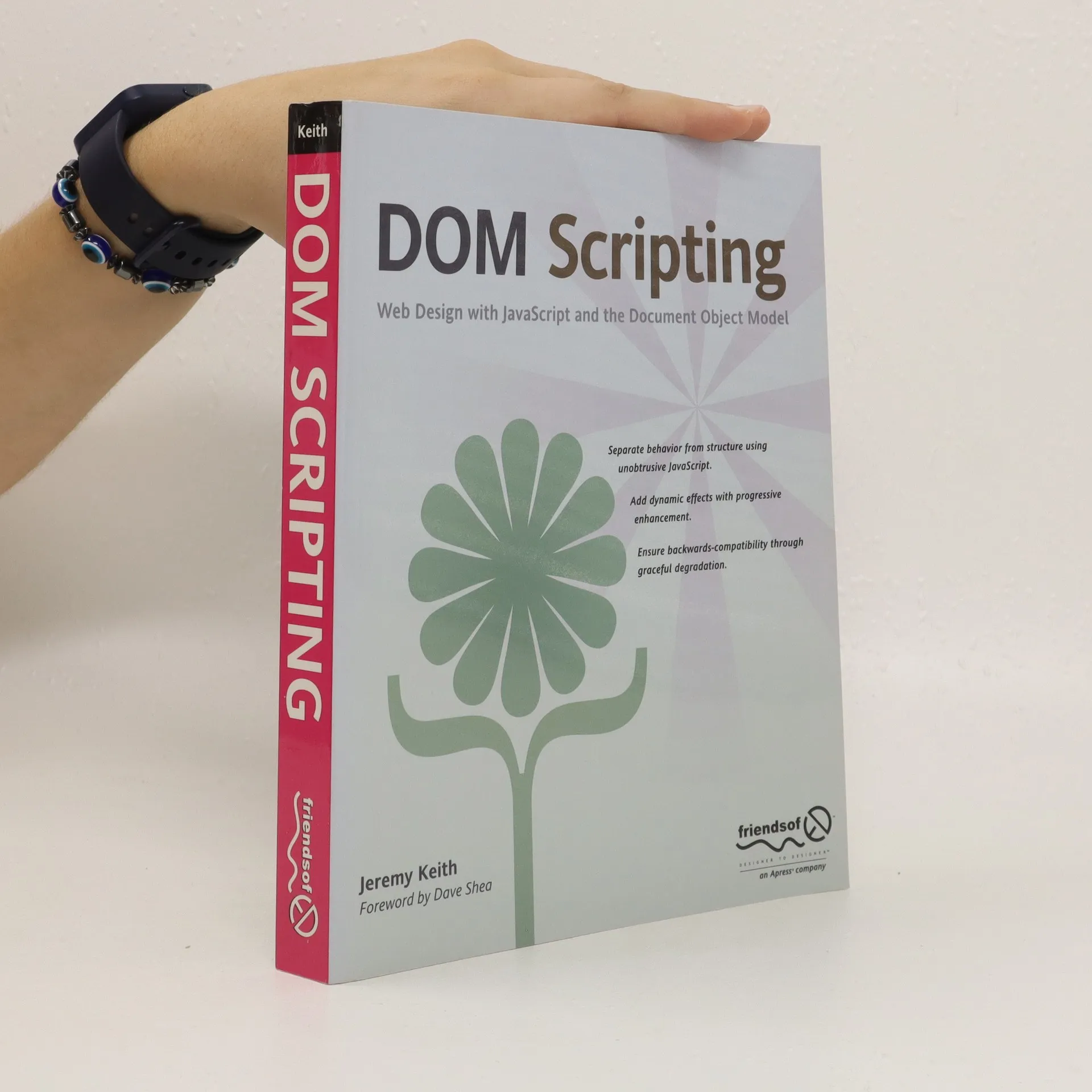
* Most JavaScript books are very long-winded, boring, and developer-oriented – this one provides a quick and easy reference for those who are not code experts, but want to quickly learn and take advantage of JavaScript/DOM to add cool functionality to their web sites. * Shows readers how to build several real world projects. * All examples are fiercely standards compliant and up-to-date.
HTML5 est la spécification HTML la plus longue jamais écrite. C'est également la plus puissante et, en un sens, la plus déroutante. Que doivent en retenir les web designers ? Comment exploiter toute sa puissance dans les navigateurs actuels ? Syntaxe, éléments mis à jour, images responsive, vidéo, microformats, microdonnées... exploitez au mieux cette spécification en constante évolution en suivant les précieux conseils de Rachel Andrew et Jeremy Keith, qui, avec style et esprit, vont droit à l'essentiel dans ce guide brillant et divertissant. La mise à jour présente les nouvelles fonctionnalités HTML5 et développe celles qui étaient peu prises en charge il y a 6 ans, aux débuts d'HTML5, notamment tout ce qui a trait à la vidéo.
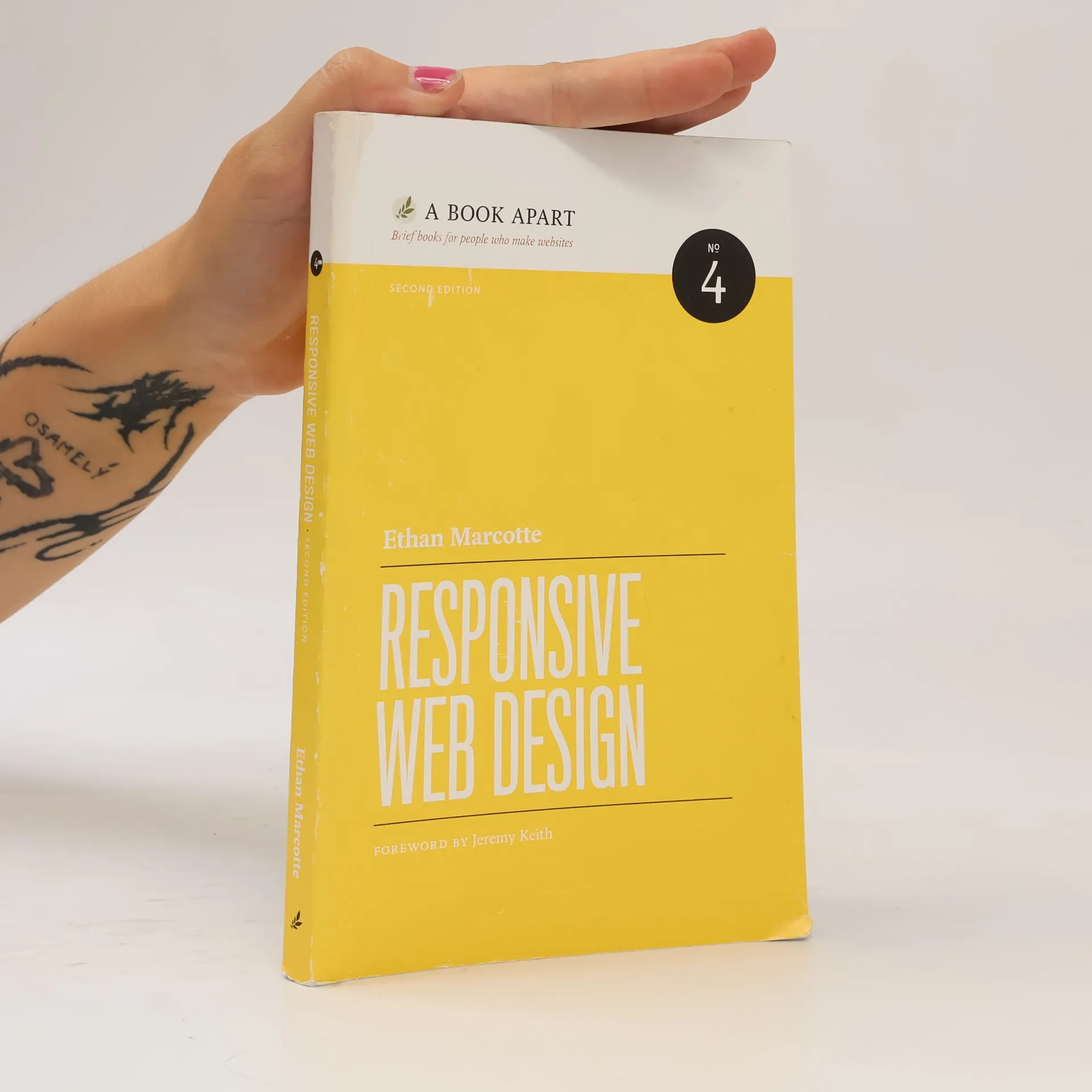
Learn how to think beyond the desktop, and craft designs that respond to your users’ needs. In the second edition of Responsive Web Design, Ethan Marcotte expands on the still-relevant design principles behind fluid grids, flexible images, and media queries. Through new examples and updated facts and figures, you'll learn how to deliver a quality experience, no matter how large or small the display.